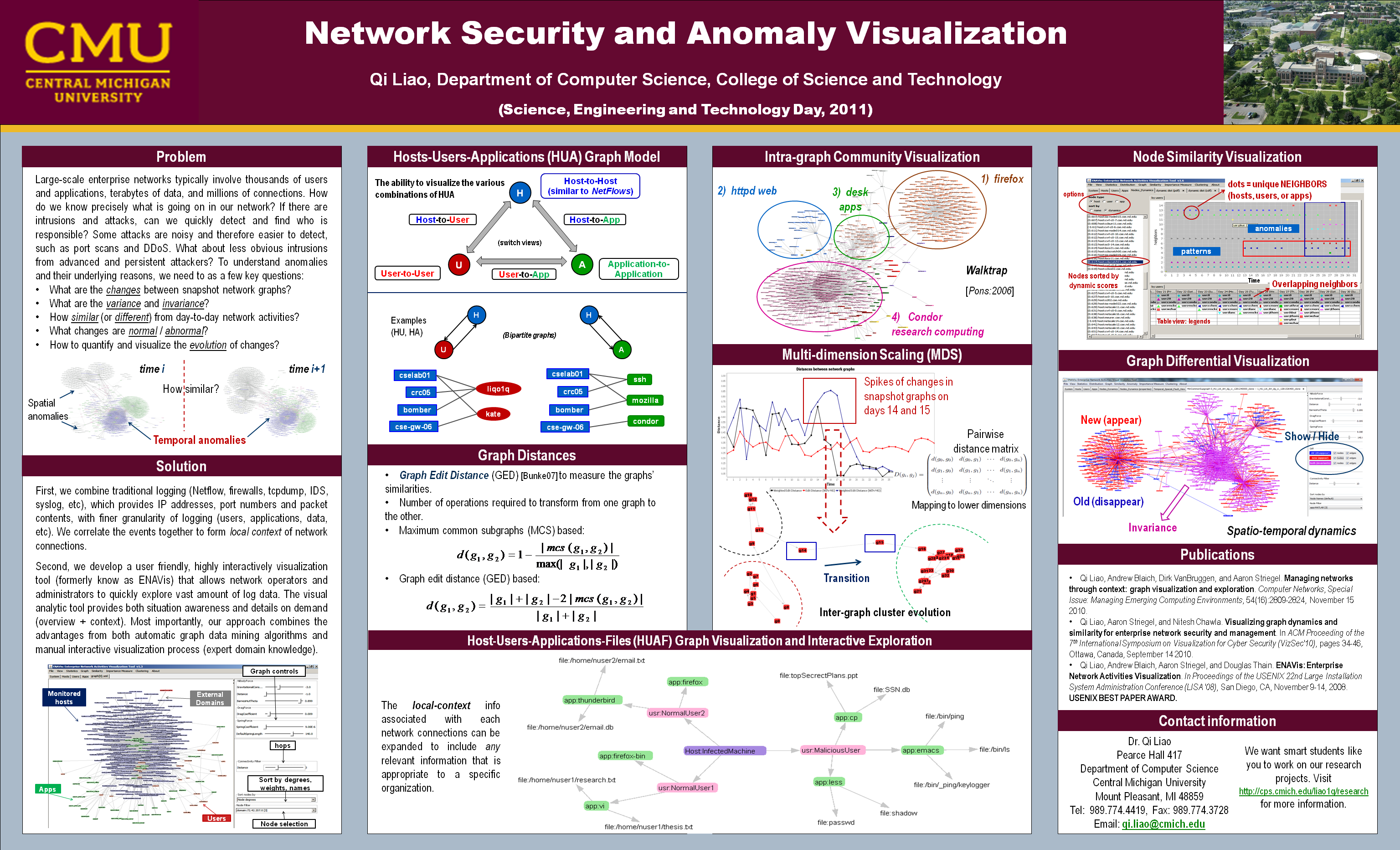
Visual analytics for network security and anomaly detection
Posters
Science, Engineering and Technology Day Friday, July 15, 2011 [view]
|
Screenshots
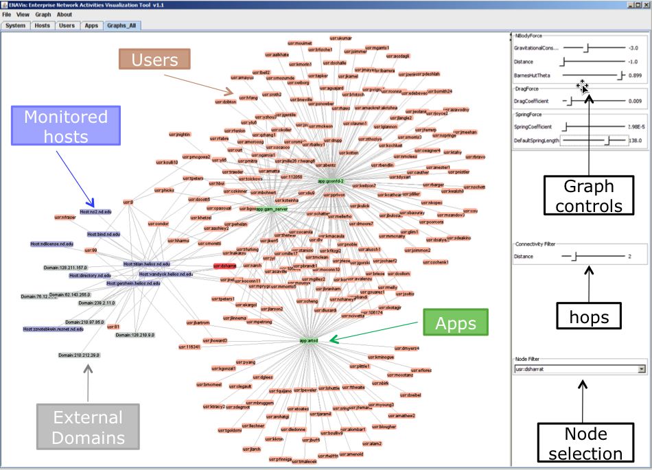 |
A screenshot of ENAVis visualization tool. Different colors encode different types of enterprise network components in a Host-user-application (HUA) graphs. |
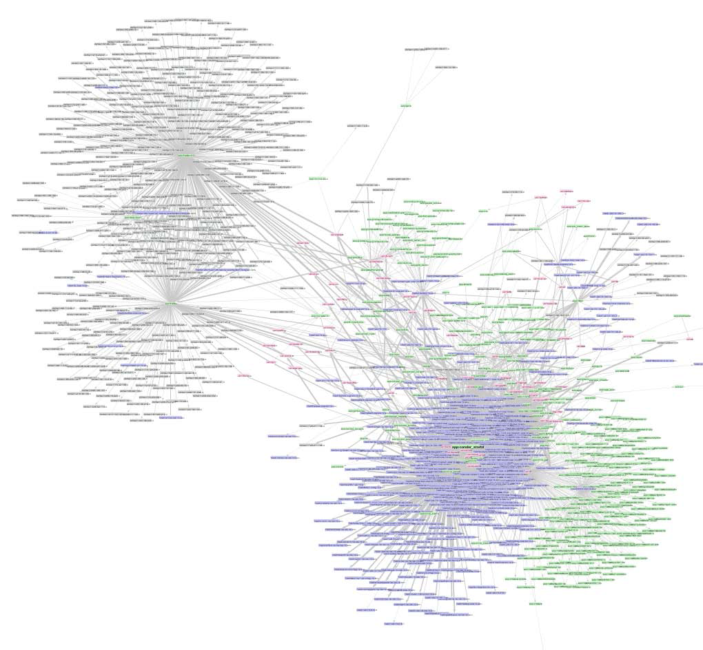 |
An example of HUA graph. |
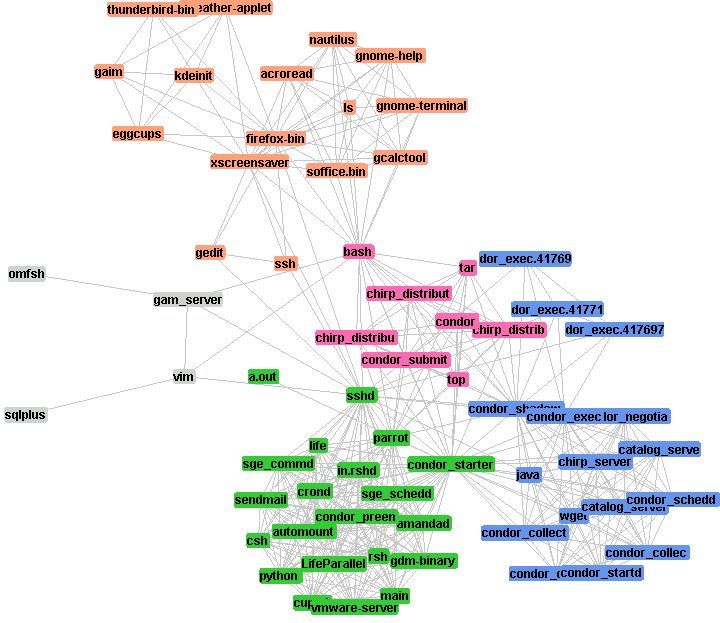 |
Similarity graph: applications run by similar users. ENAVis's clustering view using Walktrap algorithm. |
 |
Similarity graph: applications run by similar users. |
 |
Group selection of application nodes, and highlights of similar users. |
 |
Interesting bridges between clusters in application similarity graph. |
 |
Similarity graph: users who run similar applications. |
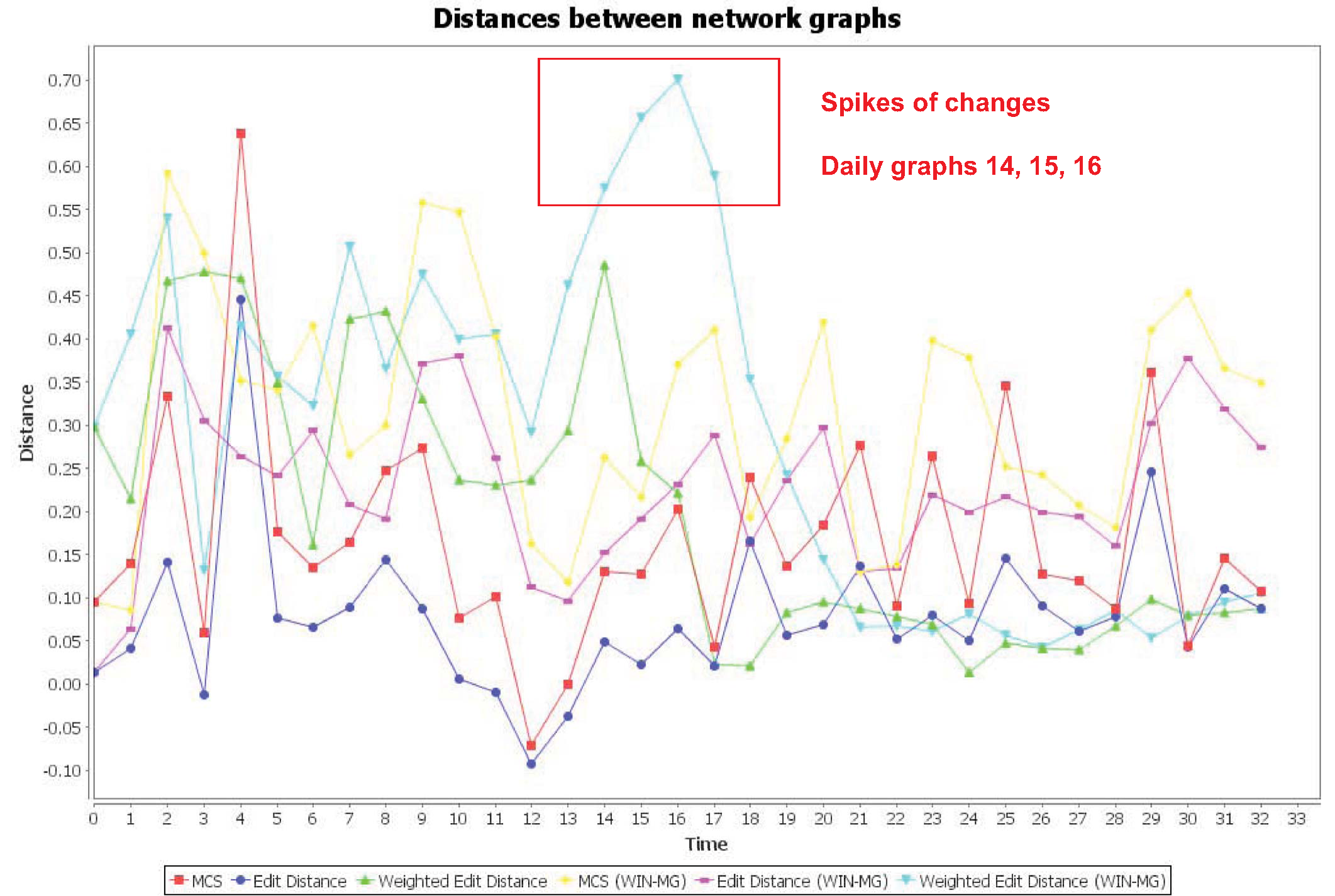 |
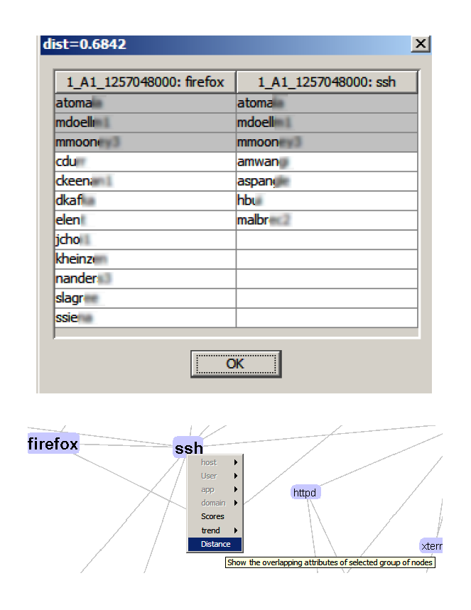
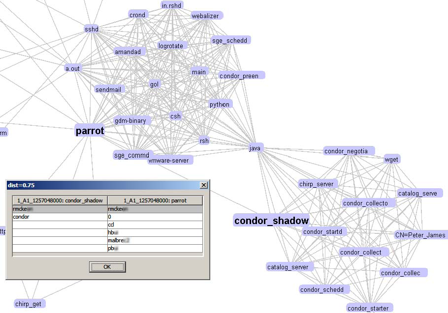
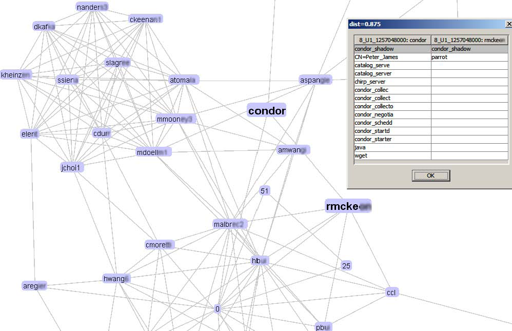
Similarity measurement of day-to-day network graphs using various distance functions. |
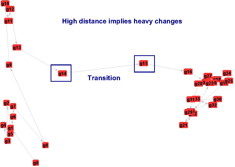 |
A multi-dimensional mapping (MDS) visualization illustrates the cluster evolution of network graphs. Network states transit at day 14 and 15. |
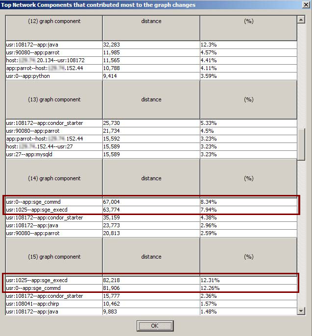 |
Drill down of the individual responsible hosts, users or applications through top n list pointing to two users: root and 1025, running Sun Grid Engine (SGE) related applications that contributed nearly 25% daily network graph changes. |
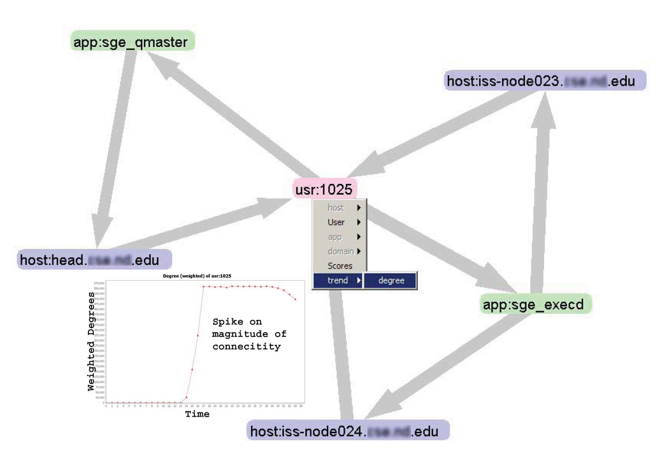 |
One-hop view from the node under investigation with automatic user activity view pins down the cause of transition during the days 14 and 15 to this user with two new applications. |
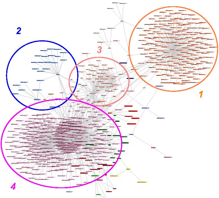 |
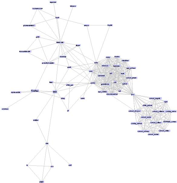
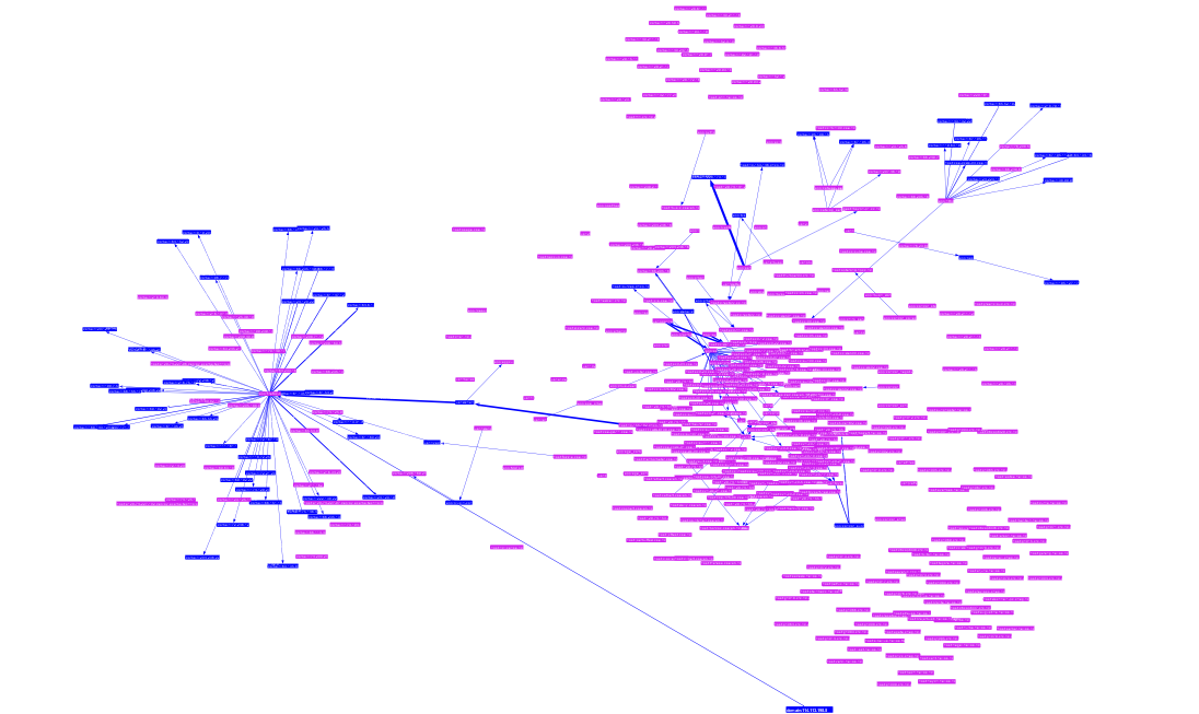
Intra-graph cluster visualization (di fferent colors represent di fferent clusters) using Walktrap algorithm helps understand the communities, e.g., fi refox users (1) and web related traffic (2), condor-related research computing community (4), or enterprise users running a set of desktop applications that exhibit similar patterns of connectivity (3). This information has potential to identify anomalous user behaviors. |
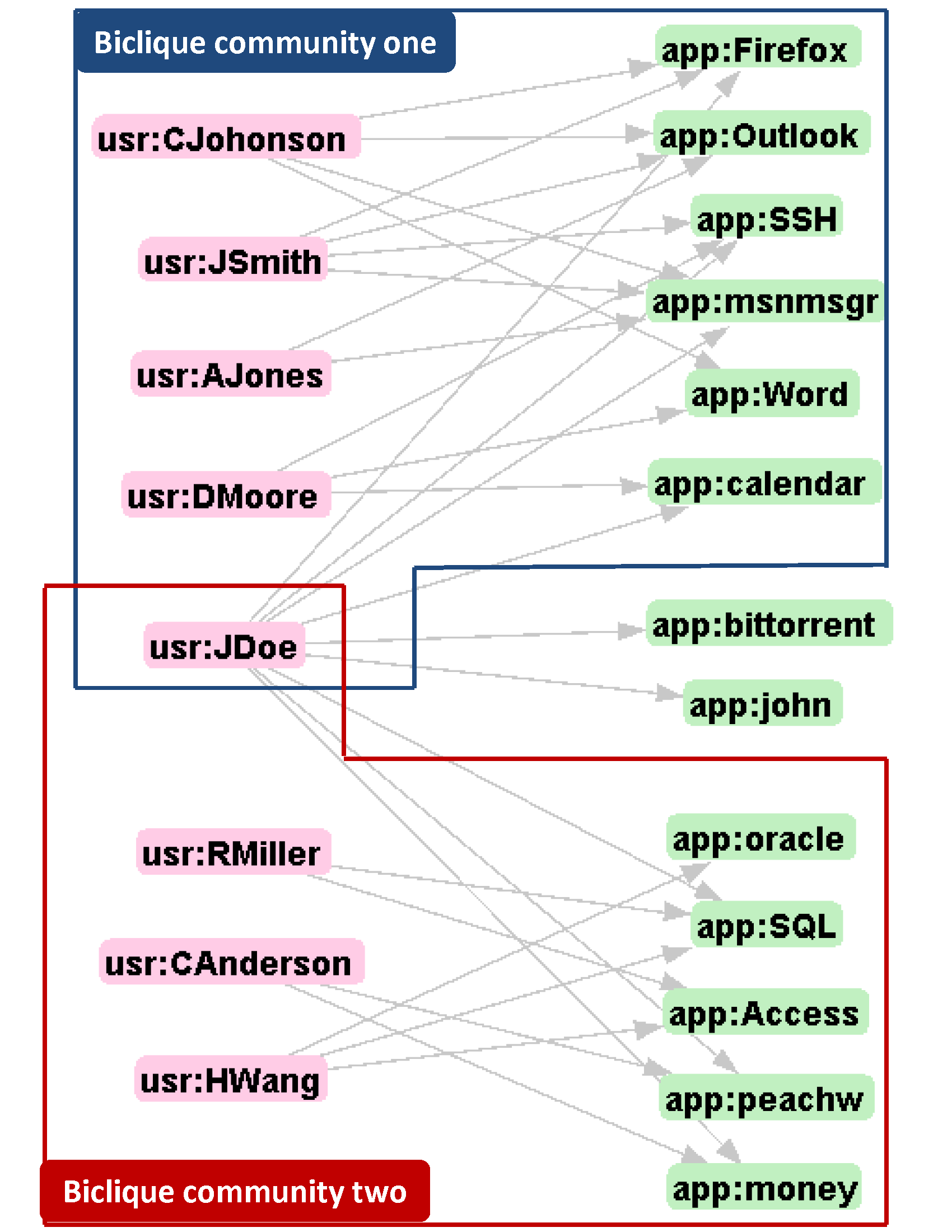 |
Example of biclique communities consisting of enterprise users running similar sets of network applications. The user JDoe migrating from an exclusive community (top) to overlapping communities (bottom) indicates possible violation of network usage policy. |
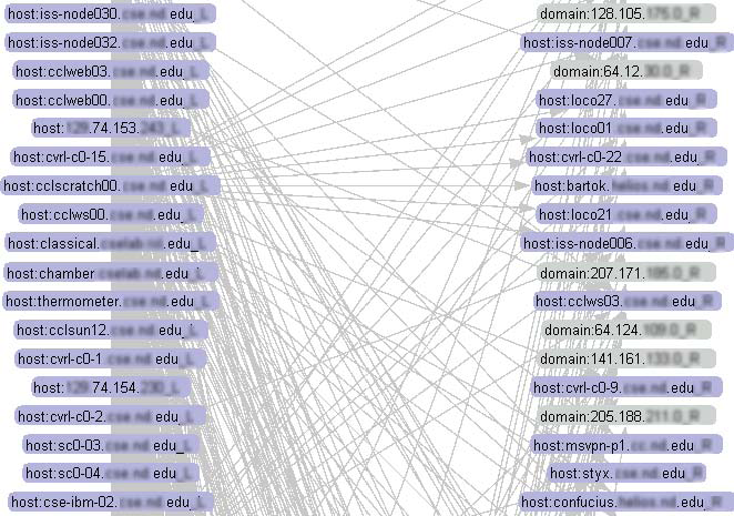 |
Bipartite View: Traffics flow between local hosts (left) and remote hosts (right). |
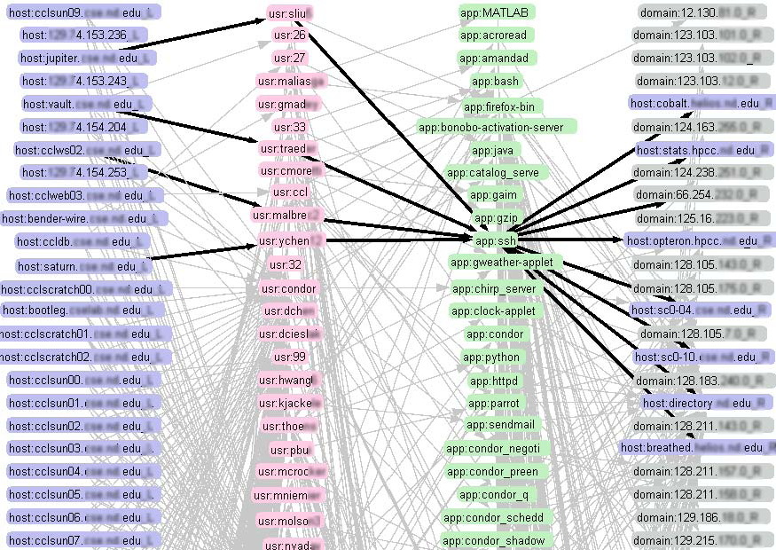 |
Quadripartite View: Gain insight information by expanding host-host relationship and visualizing continuous HUAH bipartite graphs. Rather than having a relatively simple point-to-point view (left), administrators can expand the dimensions of network connectivity with multi-bipartite view with extra information gain in users and applications (right) for elevated insight. Clicking on a questionable node will highlight the critical paths of investigation that go through that node. |
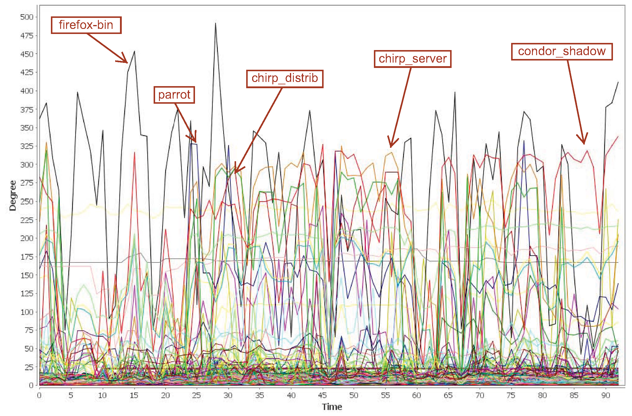 |
Dynamics of node degrees over a three-month period. Each line represents a node. Applications are among the top nodes having largest standard deviations of degree changes. |
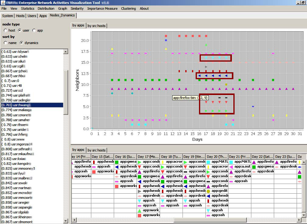 |
Nodes dynamics/similarity visualization. Selecting a questionable user node (sorted by dynamic scores) in the left list automatically plots all the applications that user ran over an entire month's period. Dots of di erent shapes and colors represent unique applications. New applications emerged from day 17 to 20 (highlighted). |
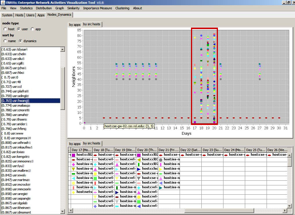 |
Changes of the source hosts on which the same user have logged and had network activities. The signi cant increase of the number of different hosts from day 17 to day 20 is caused by the new applications (condor, hexdoku, etc) highlighted in Figure 12. |
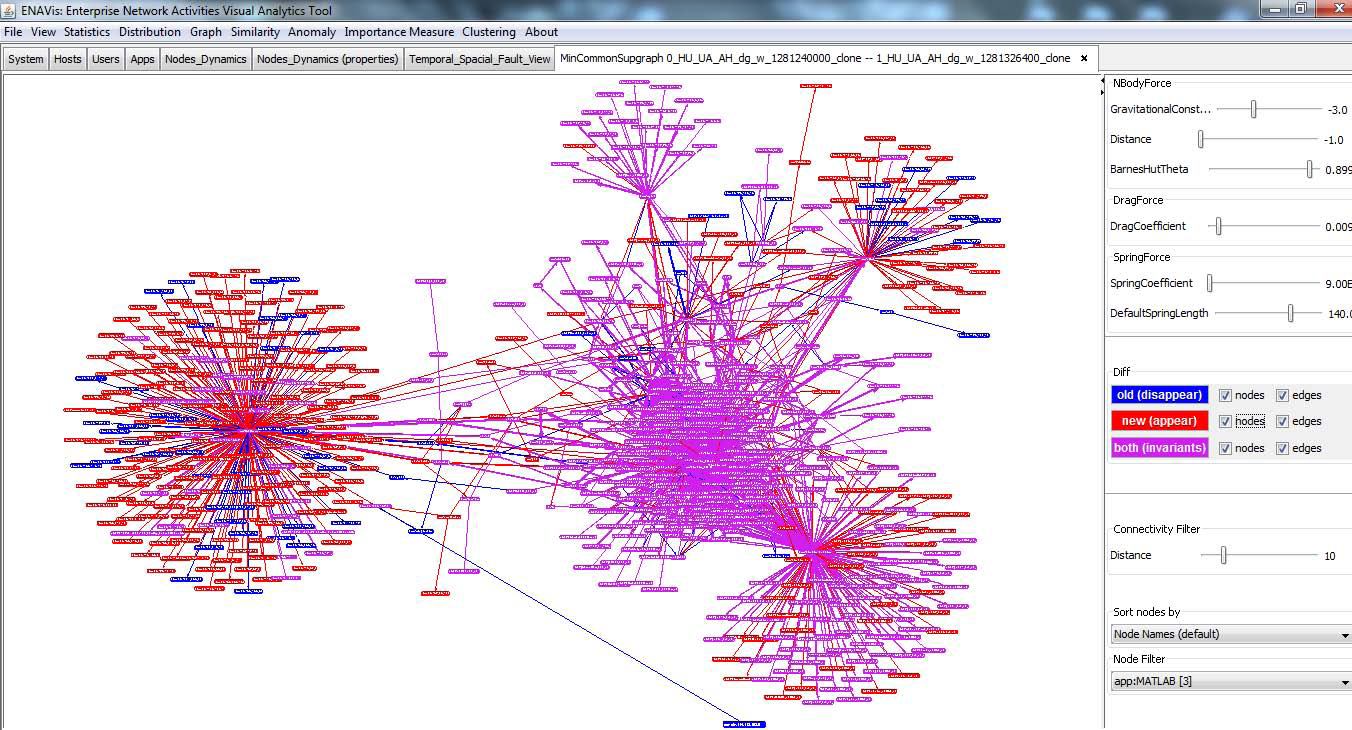 |
Overview of differential visualization of HUA graphs. Blue colors represent nodes/edges appeared only in the first graph while red colors represent those appeared only in the second graph. Purple (red+blue) intuitively represents the nodes/edges appeared in both graphs. |
 |
Filtered view showing only nodes/edges that disappeared in the second snapshot graph. |
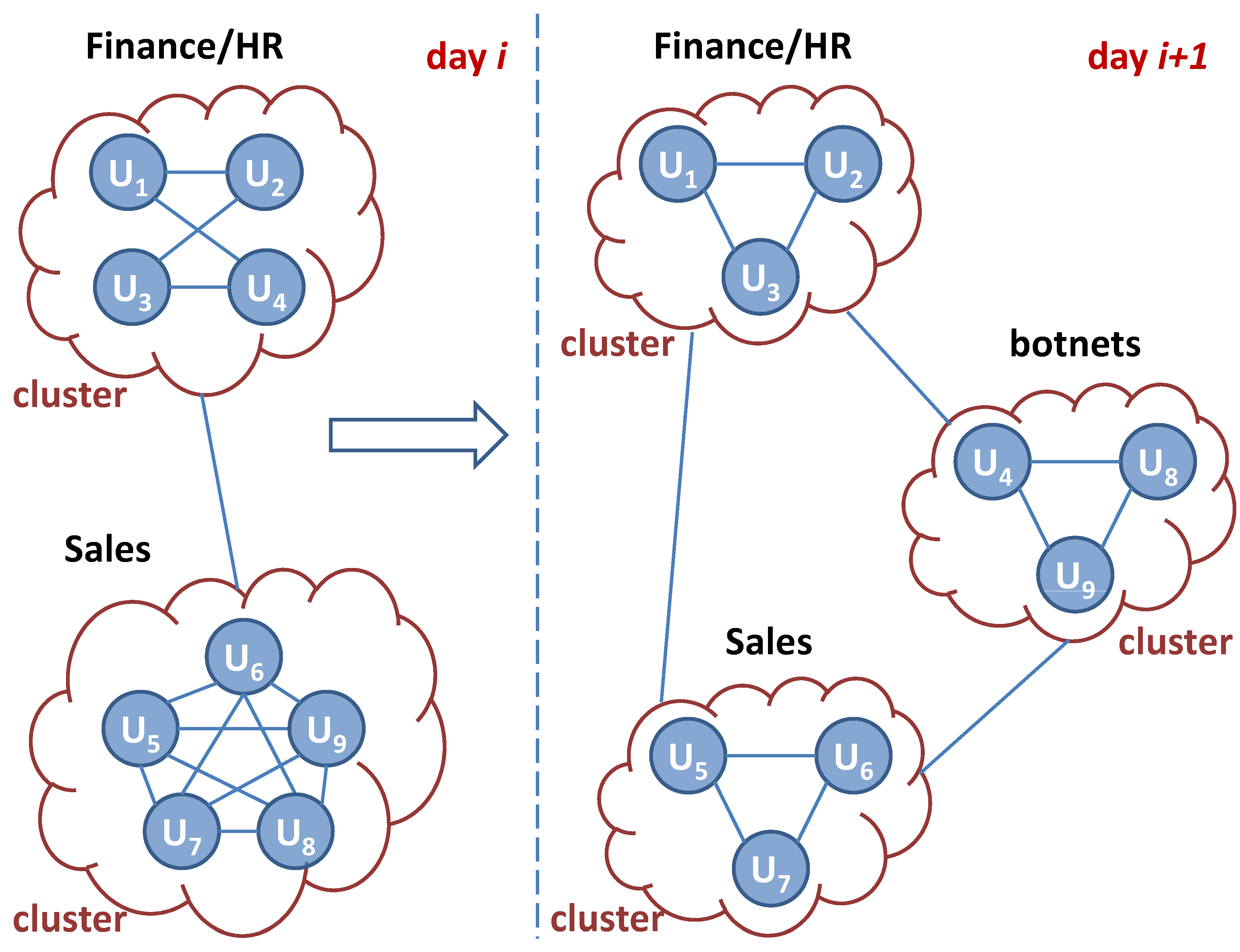 |
Illustration of concept of graph similarity visualization through cluster membership changes. The users can be connected and clustered through similar properties, such as common applications they ran, target domains they contacted, etc. |
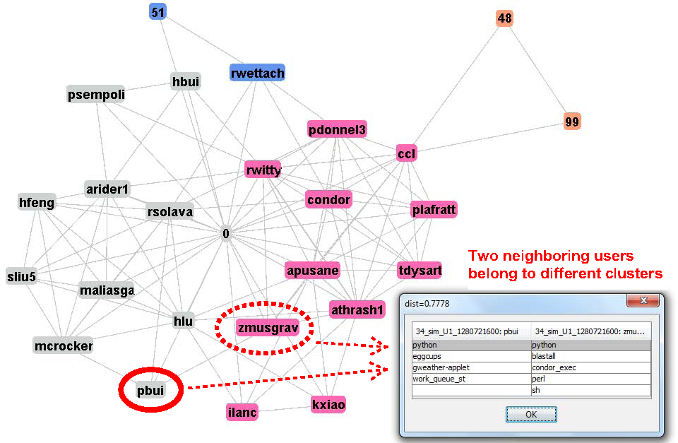 |
Clustering visualization in previous day. Specifically, enterprise user pbui belongs to the graduate student community while one of his neighbor zmusgrav belongs to condor community. |
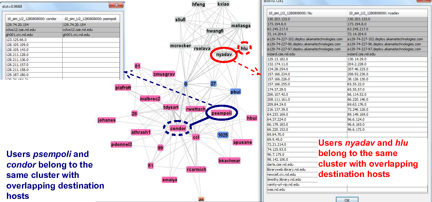 |
Clustering visualization on a snapshot user graph with edges representing similar set of destination hosts/domains. Enterprise user nyadav (solid red cycle) and psempoli (solid blue cycle) belong to graduate student community and condor community, respectively. |
Demo
| Visually explore the similar structures among snapshot graphs. | |
| A quick visualization to view the patterns/similarities of the neighborhood of nodes. | |
| Differential visualization of network graphs showing temporal changes of nodes and edges. | |
| Constructing and building similarity graphs, e.g., users are connected based on the similarity metrics of overlapping applications they run; applications can be connected based on the similar target machines they try to contact, etc. | |
| A detailed demo on various visual analytic functions included in the Enterprise Network Activities Visualization tool (ENAVis). |
Research and teaching

Read more on the research projects and course offerings.
Current projects
Current classes